Create developer presentations with MDX Deck - Part 2
Table Of Contents
In the first part of this series, we introduced MDX Deck and created a deck with the following properties:
- A slide with external images
- A slide with local images
- A couple of slides whith highlighted code
- A couple of slides with different layouts
- Theme usage
With what we saw in the first part, its possible to create pretty impressive slides.
But we can still do so more with MDX Deck!!!
In this part we’ll be seeing how to use third party components, specially the Code Surfer component. And how to publish a deck using GitHub pages with a custom sub-domain.
Speaker notes
If your are using full screen slides, is possible that you require the complete area of the slide to display your ideas, leaving no space for explanatory text.
Or just sometimes you just need a hint on why you are showing what’s in the slide.
On those cases you need the <Notes> component provided by MDX Deck.
Just add add a <Notes>...</Notes> block anywhere in your slide, and the content wont be displayed. Pe:
---

# Speaker notes

- Only the Speaker can see the notes
- `Option + P` Toggles the presenter mode
- The speaker sees the notes and the next slide

<Notes>

- If you open the presentation in another window it will stay in sync
- Only if you are using `yarn start`
- In windows is `Alt + P`

</Notes>
To access the speaker notes you have to type Option + P (Alt + P in Windows). This key combination also works to get out the speaker notes.
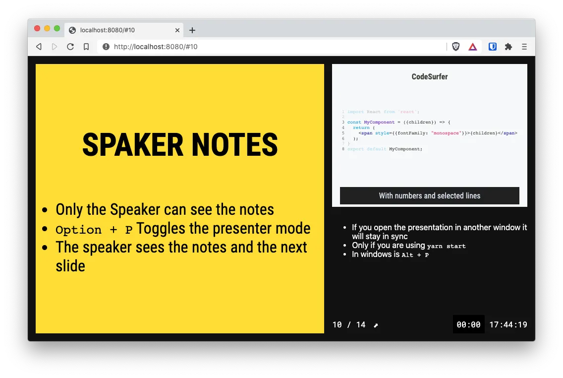
Note that you see the notes for the current slide, and the next slide. And if you are using multiple instances of your browser, the slides will stay in sync.
Headers and Footers
MDX Deck offers 2 components for adding a header and a footer. And they are called exactly like that: <Header> and <Footer>. And whatever you place in this 2 sections will appear on all the slides.
So, in our presentation I’m going to add an .svg file on the images/ folder. And that image I’ll use for the header. Also, I’m going to add a link to my blog in the footer.
Lets make those changes at the beginning of the deck:
<!-- slides.mdx -->

import { yellow, prism } from "@mdx-deck/themes"
import IconDev from './images/icon-developer.svg';
export const theme = {
  ...yellow,
  ...prism,
}

<Header>

<Image src={IconDev} style={{width: `32px`, height: `32px`, margin: `1em` }} />

</Header>

<Footer>

<div style={{textAlign: `right`}}>

[Mario Yepes](https://marioyepes.com)

</div>

</Footer>

# My very first presentation

[@marioy47](https://twitter.com/marioy47)
And now all my slides have a header and a footer:
I could have added the Header and Footer components at the end of the deck. But I just find it easier to manipulate them if they are at the beginning.
Code Surfer
CodeSurfer is a pretty awesome complement to MDX Deck. It allows you to animate the code that you are presenting in your slides.
It uses animations like
- Zooming
- Scrolling
- Focusing
- Morphing
Among others.
CodeSurfer really makes the code in your slides come to life, and helps you to get your point across very clearly.
Its like your presentation has super powers!!!
Installing and using CodeSurfer
Code surfer does not come included with MDX Deck, but you can install it with.
yarn add --dev code-surfer
And then you can create a <CodeSurfer> section in a new slide:
---

import { CodeSurfer } from 'code-surfer';
import { github, vsDark } from '@code-surfer/themes';

<CodeSurfer theme={github}>

```jsx showNumbers 3:6,8[15:38] title="CodeSurfer" subtitle="With numbers and selected lines"
import React from "react"

const MyComponent = ({ children }) => {
  return <span style={{ fontFamily: "monospace" }}>{children}</span>
}
export default MyComponent
```

</CodeSurfer>
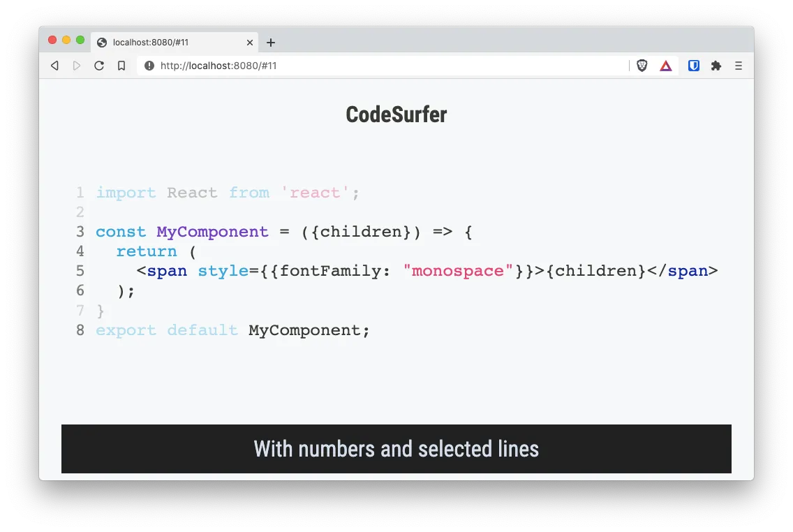
From this slide there are some things to note:
- As with other components, you can include the library right there on the slide
- CodeSurfer has its own themes (in this case we’re using the GitHub theme) and they are specified in the component.
- You have to create a regular code block and then enclose it inside a
<CodeSurfer>component. - You can add parameters on the code block
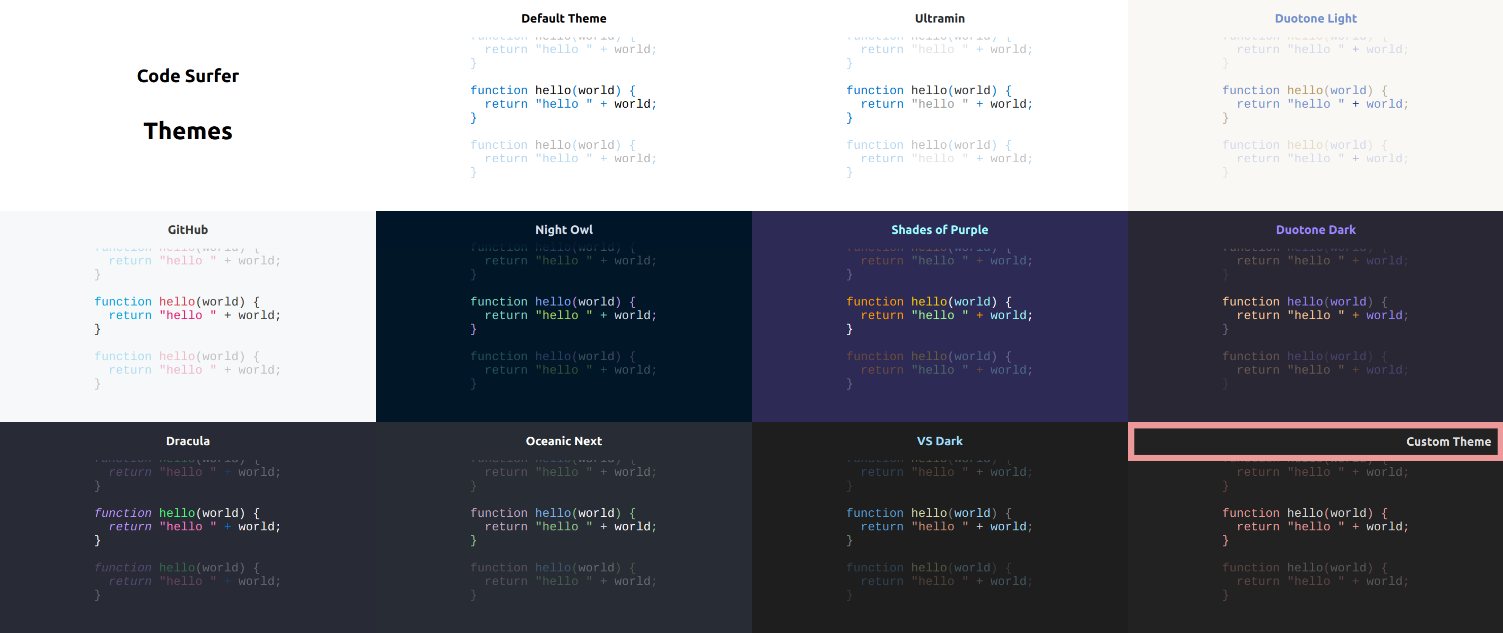
CodeSurfer: themes
You can use multiple themes in a single slide with CodeSurfer. You just have to import the theme from the @code-surfer/themes package and then pass it to the <CodeSurfer> component as a param.
<CodeSurfer theme={github}>

```jsx
...
```

</CodeSurfer>
You can find a showcase of themes here and here is the list of available themes.
CodeSurfer “code” parameters
Besides allowing you to pass params to the component. You can specify multiple parameter for each code block. And differently to the theme, the “code” parameters are specified in the code block right next to the Language declaration.
---

<CodeSurfer theme={vsDark}>

```js showNumbers title="This apperas at the top" subtitle="And this at the bottom" showNumbers
console.log("Line 1")
console.log("Line 2")
console.log("Line 3")
```

</CodeSurfer>
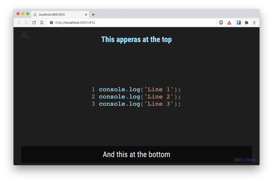
Some of the available parameters are:
titleAdds a title on the top of the code blocksubtitleAdds text at the bottom of the slideshowNumbersPrecedes each line of code with the line numberfileAllows you to import the contents of an external file
It seems that the
fileparameter has some bugs in version 4.*
CodeSurfer: Line focus
One of the first that pop out is the fact that you can emphasize lines by adding numbers at the beginning of the code:
```js 1,2[1,7]
console.log("Hola mundo")
console.log("Hello World")
```
The format is pretty simple:
- A number specifies a line
- Multiple lines are separated by
, - Ranges of lines are specified by
:. P.e.3:6 - A number inside
[and]denotes columns. But it need to be preceded by the line number. Pe.5[4] - As lines, ranges of columns are separated by
:. P.e.5[8:12]
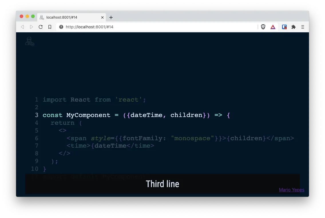
Code Focus or… Code on Steroids!
This is the most impressive part of CodeSurfer. You can animate the progression or differences in your code. You just have to add multiple blocks of code in the same slide and inside one <CodeSurfer /> component.
Take the following 3 jsx blocks of code for instance:
---

<CodeSurfer theme={vsDark}>

```jsx subtitle="Original code"
import React from 'react';

const MyComponent = ({dateTime, children}) => {
  return (
    <>
      <span style={{fontFamily: "monospace"}}>{children}</span>
      <time>{dateTime</time>
    </>
  );
}
export default MyComponent;
```

```jsx 3[22:30] subtitle="Now we highlight a word"
import React from 'react';

const MyComponent = ({dateTime, children}) => {
  return (
    <>
      <span style={{fontFamily: "monospace"}}>{children}</span>
      <time>{dateTime</time>
    </>
  );
}
export default MyComponent;
```

```jsx subtitle="And now we add more code"
import React from 'react';
import PropTypes from 'prop-types';

const MyComponent = ({dateTime, children}) => {
  return (
    <>
      <span style={{fontFamily: "monospace"}}>{children}</span>
      <time>{dateTime</time>
    </>
  );
}

MyComponent.defaultProps = {
  dateTime: "2020-10-08"
}

export default MyComponent;
```

</CodeSurfer>
When you present that single slide, you get something like the following:
Don’t know about you… But that’s pretty kick ass.
CodeSurfer: Using diff
This is pretty cool too.
Lets say that you have the same block of code that you want to emphasize in different parts using animations. Lets say that you want to focus on different lines:
---
<CodeSurfer theme={nightOwl}>

```jsx title="Using Diff" showNumbers
import React from 'react';

const MyComponent = ({dateTime, children}) => {
  return (
    <>
      <span style={{fontFamily: "monospace"}}>{children}</span>
      <time>{dateTime</time>
    </>
  );
}
export default MyComponent;
```

```diff 1 subtitle="First line"
```

```diff 3 subtitle="Third line"
```

```diff 11 subtitle="Eleventh line"
```

</CodeSurfer>
You just have to use the diff parameter, not event specifying the language, and CodeSurfer will animate it for you.
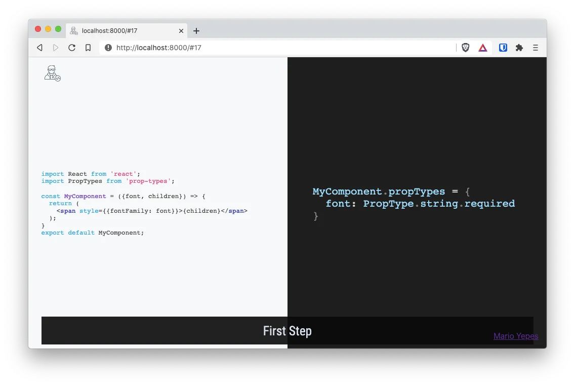
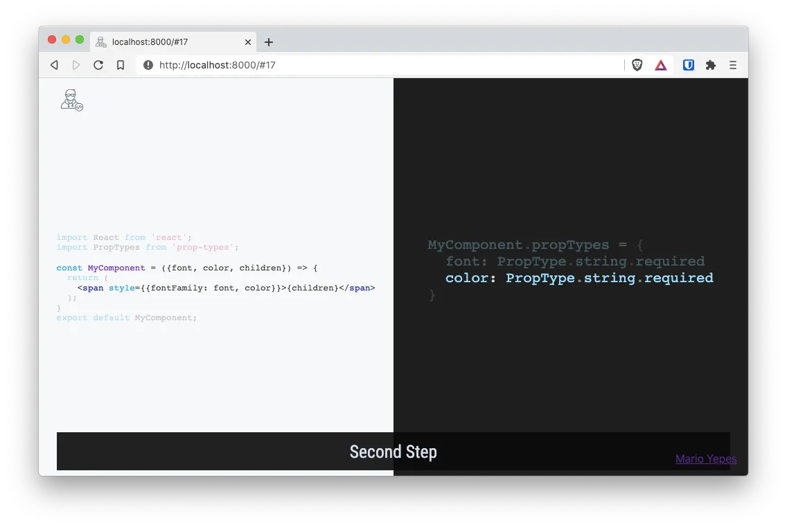
CodeSurfer: Columns
This is also a very useful feature for code analysis when you want to explain how the code evolves in several places.
Take for instance the following slide:
---
import { CodeSurferColumns, Step } from "code-surfer";

<CodeSurferColumns themes={[github, vsDark]}>

<Step subtitle="First Step">

```jsx
import React from 'react';
import PropTypes from 'prop-types';

const MyComponent = ({font, children}) => {
  return (
	<span style={{fontFamily: font}}>{children}</span>
  );
}
export default MyComponent;
```

```jsx
MyComponent.propTypes = {
  font: PropType.string.required
}
```

</Step>

<Step subtitle="Second Step">

```jsx
import React from 'react';
import PropTypes from 'prop-types';

const MyComponent = ({font, color, children}) => {
  return (
	<span style={{fontFamily: font, color}}>{children}</span>
  );
}
export default MyComponent;
```

```jsx
MyComponent.propTypes = {
  font: PropType.string.required
  color: PropType.string.required
}
```

</Step>

</CodeSurferColumns>
This will generate a single slide but with a before and an after. Those are the steps.
Also, on the before and after steps, you’ll get 2 columns.
And the transition from step to step will be animated like everything in CodeSurfer
Other documentation
This are a couple of projects and articles worth reading for further explanation