Create developer presentations with MDX Deck - Part 1
Table Of Contents
We are developers… right?
Well, maybe you aren’t, but I am… And one thing that has bugged me for the last couple of years, is creating presentations using Office tools like MS Power Point, Libre Office Impress or Google Slides.
Don’t get me wrong. I think all of them are terrific pieces of software. They make any user’s life easier and offers a myriad of tools so you can compose your documents in a snap, specially presentations.
But, we’re not average users, we’re developers 🤓…
And as developer I would like to create presentations that can be tracked using version control, that you can change themes easily, that you can reuse and fork, and most of all, something that can be done trough code not using a graphical interfaces.
Enter MDX Deck…
With MDX Deck you can create presentations using only MDX!
Taken from the MDX Deck Github Page
Wait a minute, what is MDX?
Quoting the Official Site:
MDX is an authorable format that lets you seamlessly write JSX in your Markdown documents. You can import components, such as interactive charts or alerts, and embed them within your content. This makes writing long-form content with components a blast 🚀. — MDXJs:
This basically means that you can do something like this:
## This is _mdx_

Its like a _Markdown document_, but with embeded **React Code**:

import Button from "my-components/button"

<Button />;
And React would interpret it like a component!
Note that MDX is alternative way to create React components. And not a replacement for Markdown. So to use MDX you need to create a React project or include React in your project with Webpack or Rollup.
MDX Deck
Now that we know what MDX is, we can start talking about MDX Deck.
MDX Deck is a React Project that allows you to create React based presentation decks, that can be published in web servers since the output is HTML and JavaScript (heard of the JAM Stack before????) but that are created using mdx components and not JavaScript ones.
The great thing about MDX Deck is that it does all the heavy lifting of creating a React app, bundling all the required libraries (like syntax highlighting and steps libraries) and does the initial configuration so you can focus on the content creeation using Markdown.
Start a new MDX Deck project
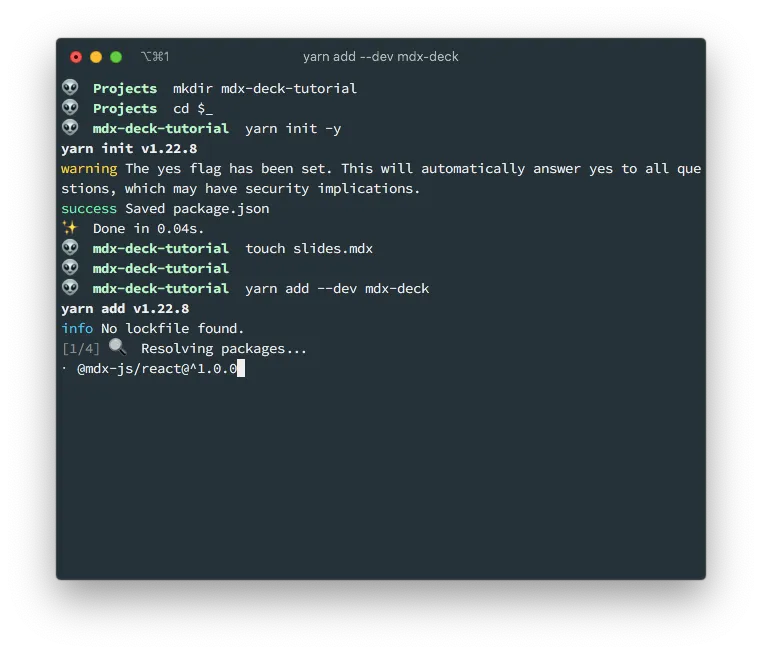
All right, let’s get our hands dirty an lest create a new presentation using MDX Deck. For that we need to create a new node project with npm init or yarn init.
I’ll be using yarn since I think is faster
mkdir mdx-deck-tutorial
cd $_
yarn init -y
touch slides.mdx
yarn add --dev mdx-deck
This will:
- Create the directory
mdx-deck-tutorial/ - Create a minimal
package.jsonfile - Create the empty
slides.mdxfile for the slides of our presentation. - Place an
mdx-deckcommand in./node_modules/.bin/mdx-deckthat will take care of generating our presentation.
If I list the contents of the current folder, minus the node_modules dir, I will get the following structure:
$ tree -I node_modules
.
├── package.json
├── slides.mdx
└── yarn.lock

0 directories, 3 files
Since accesing the mdx-deck command using ./node_modules/.bin/mdx-deck is a pain, we’ll be creating a new start script in the pacakge.json file to execute it for us.
// package.json
{
  "name": "mdx-deck-tutorial",
  "version": "1.0.0",
  "main": "index.js",
  "license": "MIT",
  "devDependencies": {
    "mdx-deck": "^4.1.1"
  },
  "scripts": {
    "start": "mdx-deck slides.mdx"
  }
}
The mdx-deck comand requires the name of the .mdx file to execute. That’s why I appended the slides.mdx at the end. Because that’s the name that I selected for my presentation.
First slides of your presentation
Before we create the slides of our presentation by adding content on the slides.mdx file, there are some things that you have to take into account:
- All the slides will be in that one file (
slides.mdx) - Each slide is separated by
---(3 dashes) - Almost all Markdown syntax is valid. One exception are local images
- You have to use the
.mdxsuffix. Otherwise your deck it won’t picked up as a component. - You get a live reload out of the box
- You control all the presentation aspects from the
.mdxfile. No need (although you can) to create additional files.
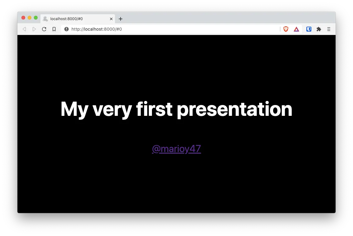
Now that we know that, lets add the following content to our slides.mdx file:
<!-- slides.mdx -->
# My very first presentation
[@marioy47](https://twitter.com/marioy47)
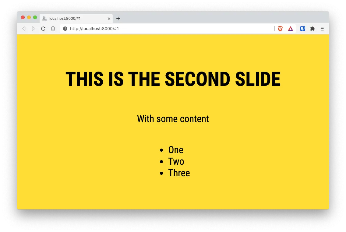
---
# This is the second slide
With some content
- One
- Two
- Three
---
# Now with a remote image

And execute yarn start to start the local development server and see your first 3 slides:

At the time of this writing there is an issue with mdx-deck 4.1.0 where the terminal keeps reloading. You can do a
yarn add --dev [email protected](downgrade mdx-deck) to temporary solve this issue. You might want to follow this Github issue for more information.
Adding local images
The first, and hopefully only, problem you are going to run into, is the fact that you can not include local images using the Markdown Syntax. The reason for this is because you are building a React project.
To include images in regular Markdown you could use something like

So you can not include local images, but you can create Image components.
So lets create an images/ sub-dir and download an image from Unsplash and place it there.
$ tree -I node_modules
.
├── images
│   └── jorge-gardner-5DqvsOPKdlk-unsplash.jpg
├── package.json
├── slides.mdx
└── yarn.lock

1 directory, 4 files
Then lets add a new slide, on the slides.mdx file with the following content:
---

# Using a local image

import ImgPath from "./images/jorge-gardner-5DqvsOPKdlk-unsplash.jpg"

<Image src={ImgPath} style={{maxWidth: `900px`}} />
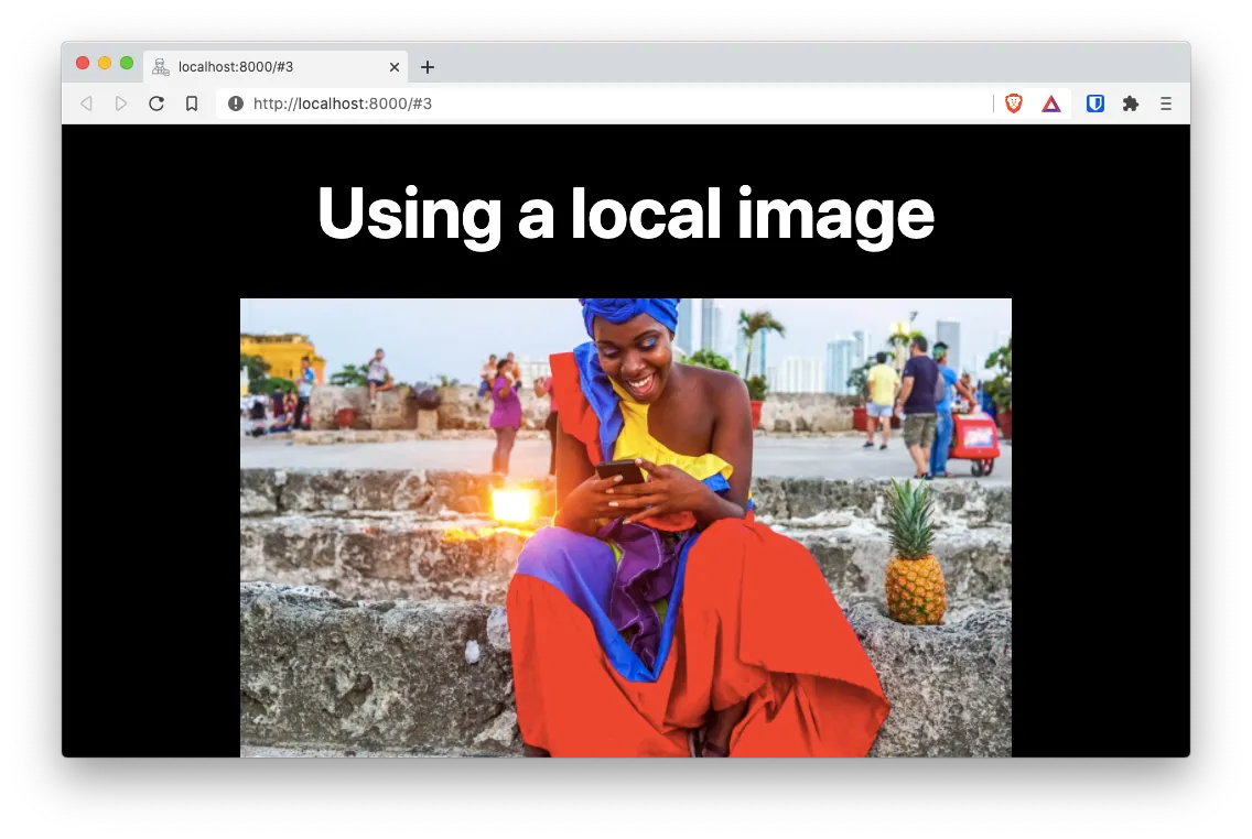
If you know react (and I’m assuming you do) you can see that you are including a local image path and then adding an <Image> component.
NOTE
- The
<Image>component is provided by MDX Deck and made available by default. - You can used something like
<img src={{ImgPath}} />too. But<Image>is more powerful
Also notice that you are using the import right into the slide and not at the top of the file. Its not necessary to import components at the top of the file, even tough you can.
Using themes
What is a presentation without fancy colors.
Quoting the docs:
MDX Deck uses Theme UI and Emotion for styling, making practically any part of the presentation themeable.
So, now that you have created a basic deck with a handful of slides, lets give it some life bye adding brilliant colors provided by the yellow theme.
Add the following code to the top of your presentation so it covers all the slides:
<!-- slides.mdx -->

import { yellow } from "@mdx-deck/themes"

export const theme = yellow

# My very first presentation

[@marioy47](https://twitter.com/marioy47)

---

...
There is a list of included themes here. And you can create your own.
Syntax Highlighting
This is the best part of MDX Deck… At least for me.
You can include code with syntax highlighting in your presentations! You just have to include a syntax highlighting theme and let it paint your code.
For that we have to change the top of the file slides.mdx with the following:
<!-- slides.mdx -->

import { yellow, prism } from "@mdx-deck/themes"

export const theme = {
...yellow,
...prism,
}

# My very first presentation

[@marioy47](https://twitter.com/marioy47)

---

...
And then add a new slide by adding the following at the end of the same file:
---

# Native Syntax Highlighting

```jsx
import React from "react";

const FirstComponent = (props) => {
return <h1>Highlighting</h1>;
};

export default FirstComponent;
```
And voilà. We beautiful code in our new slide.
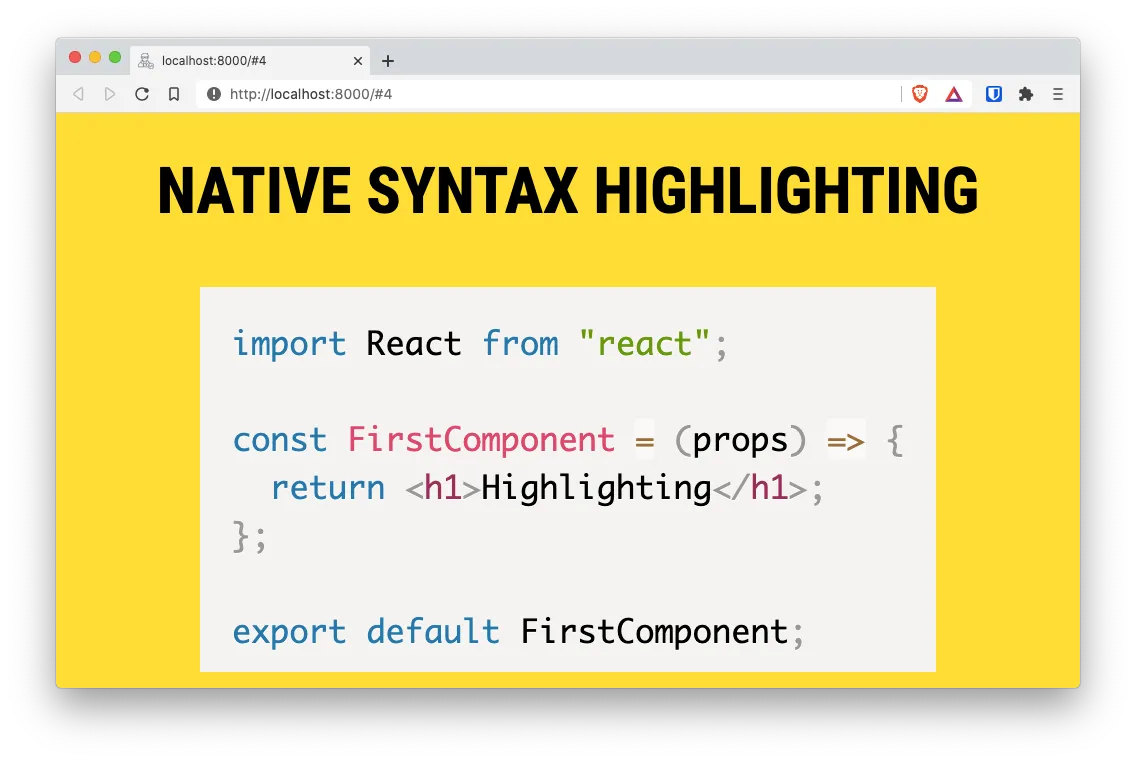
In the example I’m using the prism theme. But I could also use the highlight theme (I know… It’s an awful name for a highlight theme).
Latter we’ll see how to use advanced syntax highlighting with the help of an external module.
Using components
MDX Deck creates a React app that behaves like a presentation. This means that you can create an use components.
Lets test that by creating the components/ sub-dir and add an empty file:
mkdir components/
touch components/counter-button.js
The content of our new component will be a simple button with a counter:
// components/counter-button.js

import React, { useState } from "react";
import styled from "@emotion/styled";

// Button style with Emotion Styled
const Button = styled.button`
  padding: 0.7rem 2rem;
  border-radius: 0.6rem;
  font-size: 1.5rem;
`;

// Component
const CounterButton = () => {
  const [counter, setCounter] = useState(0);

  const increment = () => {
    setCounter(counter + 1);
  };

  // Button component whith the style
  return <Button onClick={increment}>Counter: {counter}</Button>;
};

export default CounterButton;
And in our presentation add the following “slide”:
---

# Using a custom component

import CounterButton from './components/counter-button.js';

<CounterButton />;
And the result is this new slide:
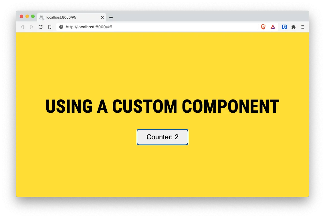
And just like that, you have a functional component inside a presentation. If you are following along, you can check that by clicking on the button the internal counter increments.
There are a couple of things to note here:
- We can import the component right in the slide. You don’t have to import it at the top of the file.
- You can use Emotion styled components out of the box since they are included when you install the MDX Deck package.
Steps
This is the scenario: You want to include a list of items in your slide, but you want to show each item only when you press the space bar or the “right” arrow.
For that, MDX Deck includes the handy Steps component.
When you enclose a list (or multiple components) between <Steps> and the </Steps> tags, you get a list that only show its items when the speaker presses the space bar or the right arrow key:
---

# Using a list with steps

Use the space bar to go to the next step

<Steps>

1. First step
2. Second step
3. Third step

</Steps>
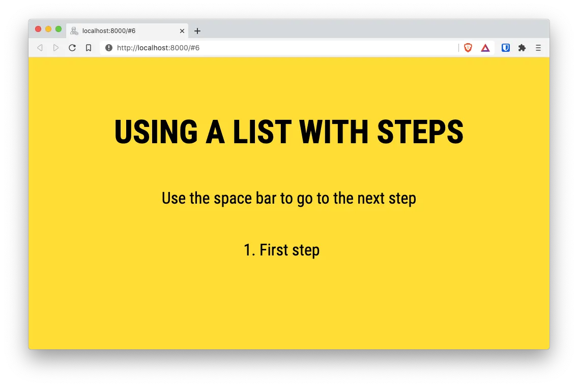
One important thing to note: There needs to be a space before and after the list items. Otherwise MDX wont recognize the list.
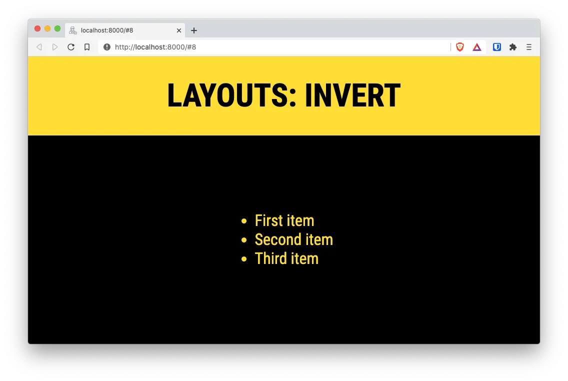
Layouts
Slides where you have different content on the left and the right. Or where you have to specify a before and an after by separating content on the top and the bottom is very common.
For those use cases, MDX Deck offers multiple layouts components
You have layouts for
- Invert to invert colors
- Split left & Right
- SplitRight Right & Left
- Horizontal
- Full Screen Code
Additionally, you can create your own layouts!
To test the Layout components, add the following slides to your deck:
---
# Layouts: Split left & right
<Split>


</Split>
---
# Layouts: Invert
<Invert>
- First item
- Second item
- Third item
</Invert>
---
# Layouts: FullScreenCode
<FullScreenCode>
```jsx
import React, { useState } from "react"
export default const CustomButton = () => {
const [counter, setCounter] = useState(0)
const increment = () => {
setCounter(counter + 1)
}
return <button onClick={increment}>Counter: {counter}</button>
}
```
</FullScreenCode>
That will render the following slides:

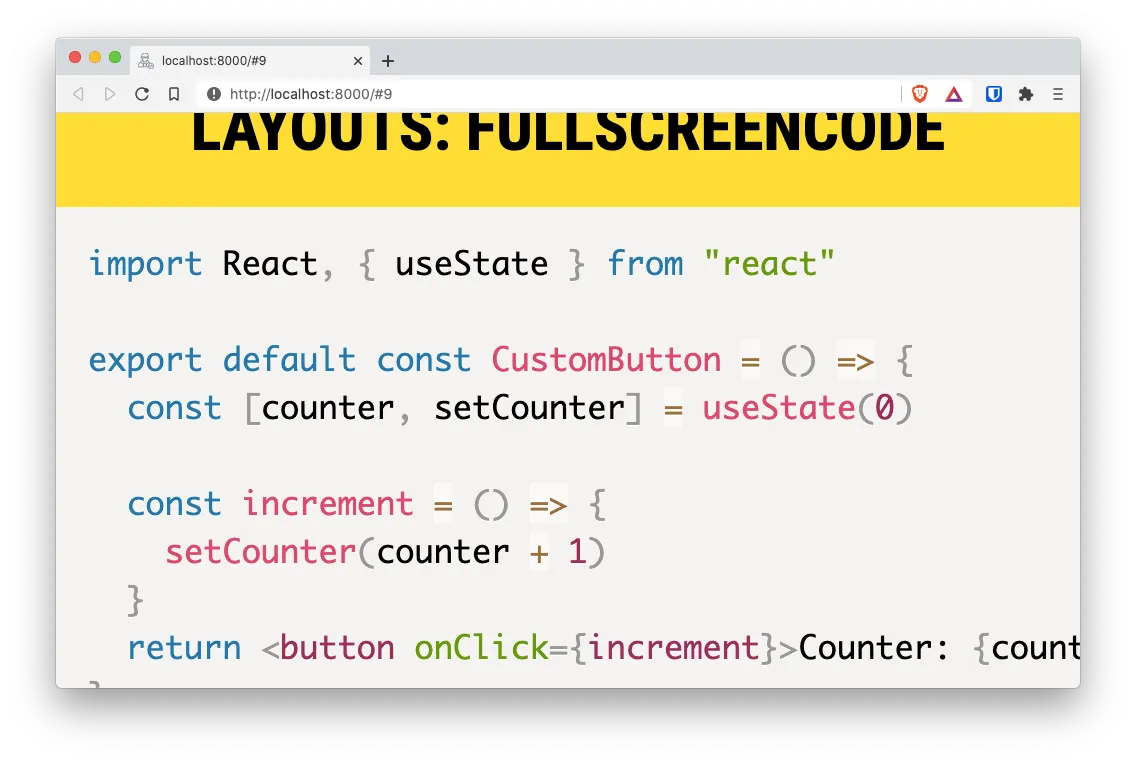
As you can see in the last one, <FullScreenCode> allows you to add code to to a slide that takes over the whole slide content.
Building your presentation
There are still a lot of additional things we can do with MDX Deck. But for now lest focus on creating a “publishable” version of your presentation.
MDX Deck can build your slides into a single .html file and a bunch of .js and .css files. For that, we need to execute the mdx-deck command with the build parameter.
To make our life simpler, lets add a new script in the package.json file that calls the build step with the correct options:
// package.json
{
  "name": "mdx-deck-test",
  "version": "1.0.0",
  "main": "index.js",
  "license": "MIT",
  "devDependencies": {
    "mdx-deck": "^4.1.1"
  },
  "scripts": {
    "start": "mdx-deck slides.mdx",
    "build": "mdx-deck build slides.mdx"
  }
}
And with that change done, lets build our project with yarn build:
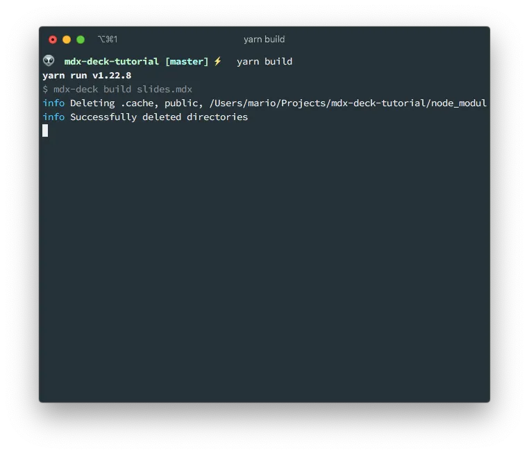
This will crate the public/ directory with the publishable files:
$ ls public/
app-19039aec0029c6075d10.js
app-19039aec0029c6075d10.js.LICENSE.txt
app-19039aec0029c6075d10.js.map
chunk-map.json
component---slides-mdx-38ee3c0e0acfec1fe58d.js
component---slides-mdx-38ee3c0e0acfec1fe58d.js.map
framework-4ad6f72b95fab36bb534.js
framework-4ad6f72b95fab36bb534.js.LICENSE.txt
framework-4ad6f72b95fab36bb534.js.map
index.html
page-data
polyfill-53a4b90aa8233609c5bb.js
polyfill-53a4b90aa8233609c5bb.js.map
static
webpack-runtime-a8ba26beef7b8523e68b.js
webpack-runtime-a8ba26beef7b8523e68b.js.map
webpack.stats.json
You can do a quick test of the result by using Python’s http.server module:
cd public/
python3 -m http.server
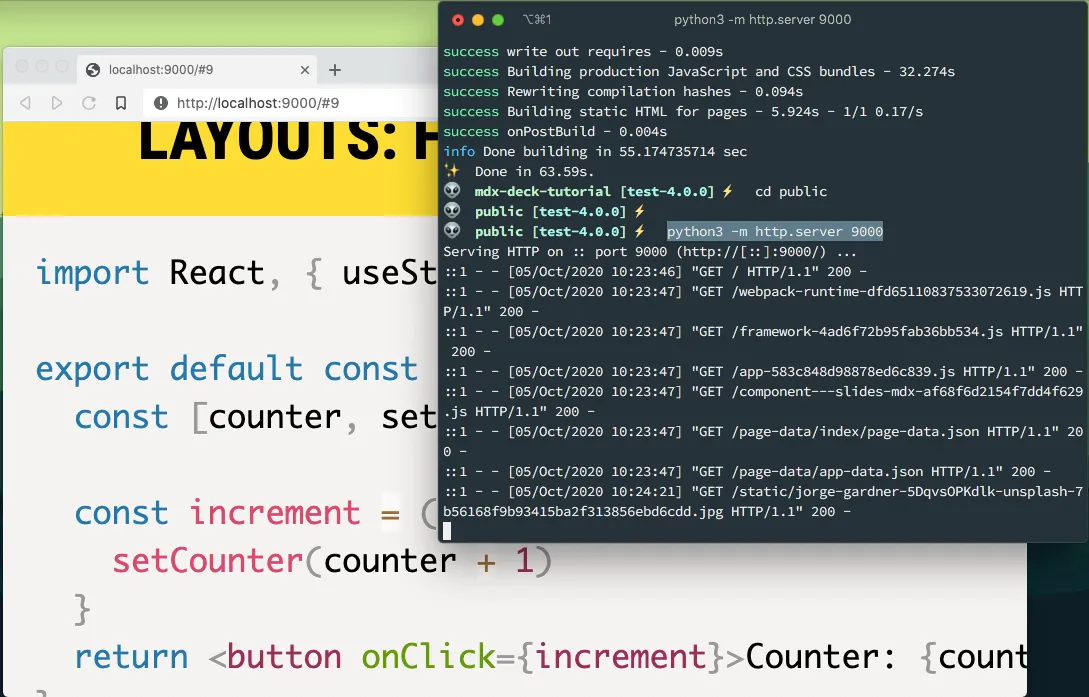
Actually this is my preferred way of presenting instead of using yarn start. The reason being that the this consumes much less resources since there is no watch process executing and the files we’re using are static.
Also, you can publish this files in a web server with one caveat:
MDX Deck assumes that the files are going to be published on the Document Root of your web server.
So you if you are going to use something like GitHub Pages you need to use the Custom domain option.
Final thoughts
In this first part we learned how to create a basic MDX Deck presentation with local images, syntax highlight and different layouts.
In the second part we’ll be looking on how to publish the presentation on a custom domain and how to take the source code presentation to the next level.
Stay safe for now.