React Storybook Intro and Setup
Table Of Contents
Recently I needed to create a React project for a client that required multiple complex components including an Week Calendar widget, and Image Selection widget, and a small Survey widget. This turned out to be the perfect excuse to apply Component Driven Development:
Component-Driven Development (CDD) is a development methodology that anchors the build process around components. It is a process that builds UIs from the “bottom up” by starting at the level of components and ending at the level of pages or screens. — @tmeasday https://blog.hichroma.com/component-driven-development-ce1109d56c8e
That’s where Storybook enters.
Storybook is a development environment and playground for creating UI components in an isolated environment inside your React (or Angular or Vue o Svelte) project but outside your application.
This means that you can develop your components, style them and see the graphical outcome before you integrate them into your application.
…I can’t think on something more useful.
Take a look at the video from the official documentation on how Storybook allows you to review components in an isolated environment:
Other advantages of storybook are:
- Helps team development since you can showcase the components and have them displayed outside the business logic
- Allows you to change components
props(or args) directly in the browser, and see the changes interactively. - You can get accessibility feedback on your components (color and contrast)
Storybook is Framework Agnostic. This means that you can use it on your React, Anglular, Vue, Svelte, etc. You can even use it into your vanilla HTML/JavaScript projects.
In this article I’m going to give you a brief introduction to Storybook and apply it into a React project.
Project setup
To setup Storybook, we first need a React project. So create one using create-react-app:
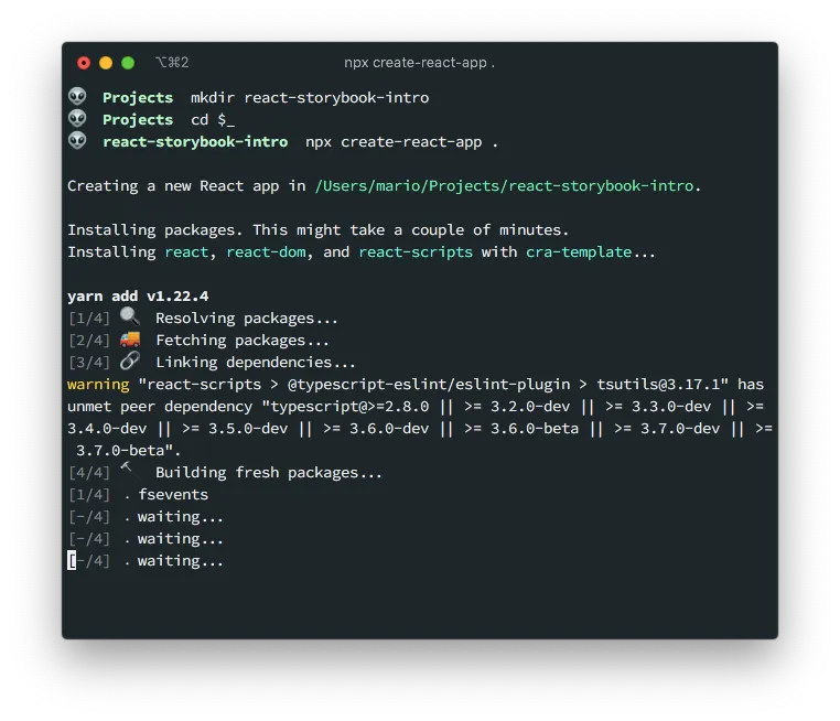
mkdir react-storybook-intro
cd $_
yarn create react-app .
If you have an existing React project you don’t need to execute this step:
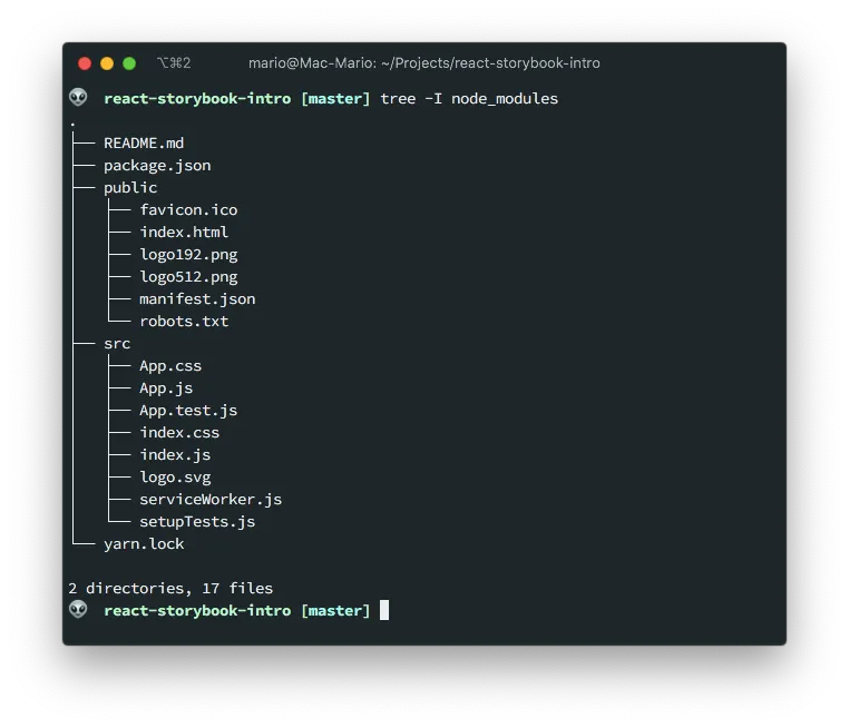
This will generate the typical React project files:
And just like that we’re ready to add Storybook to our project.
Install storybook
As I said before, storybook requires an existing project. If you already have one (or created one following the preview step) then you can execute the following command to add it:
npx sb init
IMPORTANT
You have to execute it while in your project directory
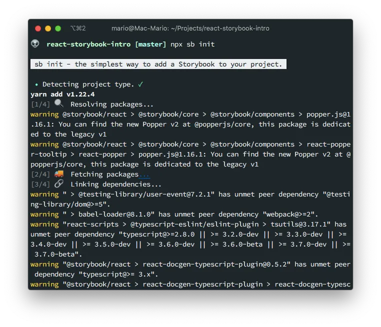
This command takes a while to complete and does a myriad of things:
- Detects the framework or type of project you are working with
- Install the storybook
npmpackage inpackage.jsonand some requirements like Babel - Install some basic Storybook Add-ons in
package.json. These arenpmpackages obviously - Adds 2 new scripts in
package.jsonto run (yarn storybook) and build (yarn build-storybook) storybook stories - Creates the
.storybookdirectory with thestorybookconfiguration - Creates the
src/stories/folder with example stories
We’ll be touching on some of those items latter.
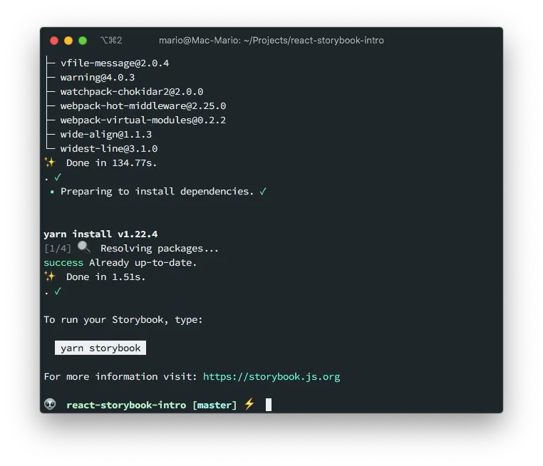
Start Storybook
As I said in the previous section, there are 2 new scripts in you package.json to run storybook.
yarn storybookyarn buld-storybook
We can execute the first one with npm run storybook. Or, if you are using yarn like I am, with:
yarn storybook
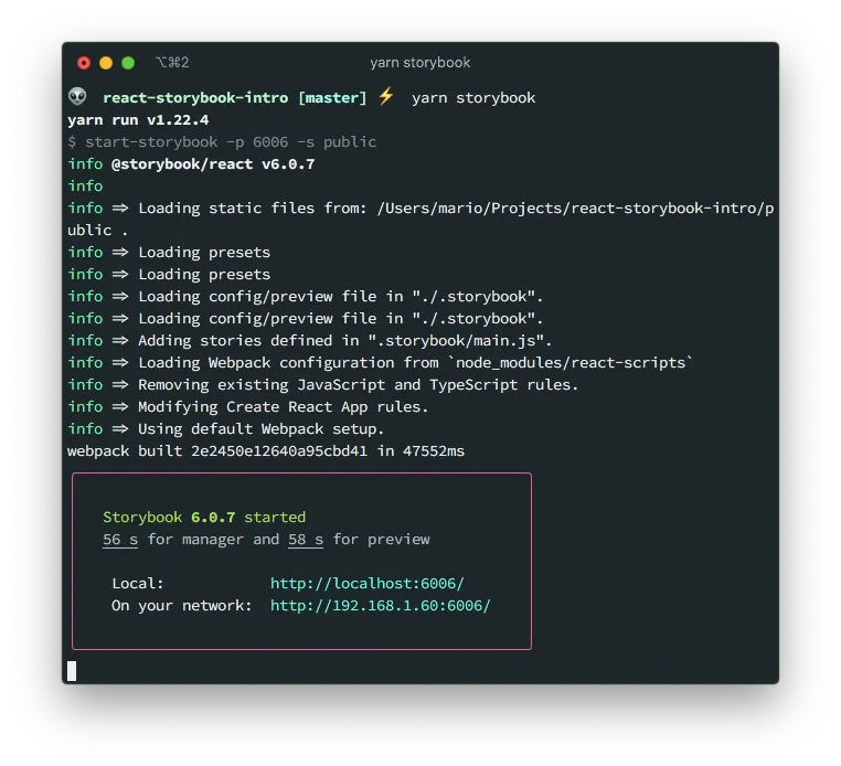
This will start a new development server (not the same one as the react’s one), that you can access on port 6006, showing the demo stories that npm sb init created:
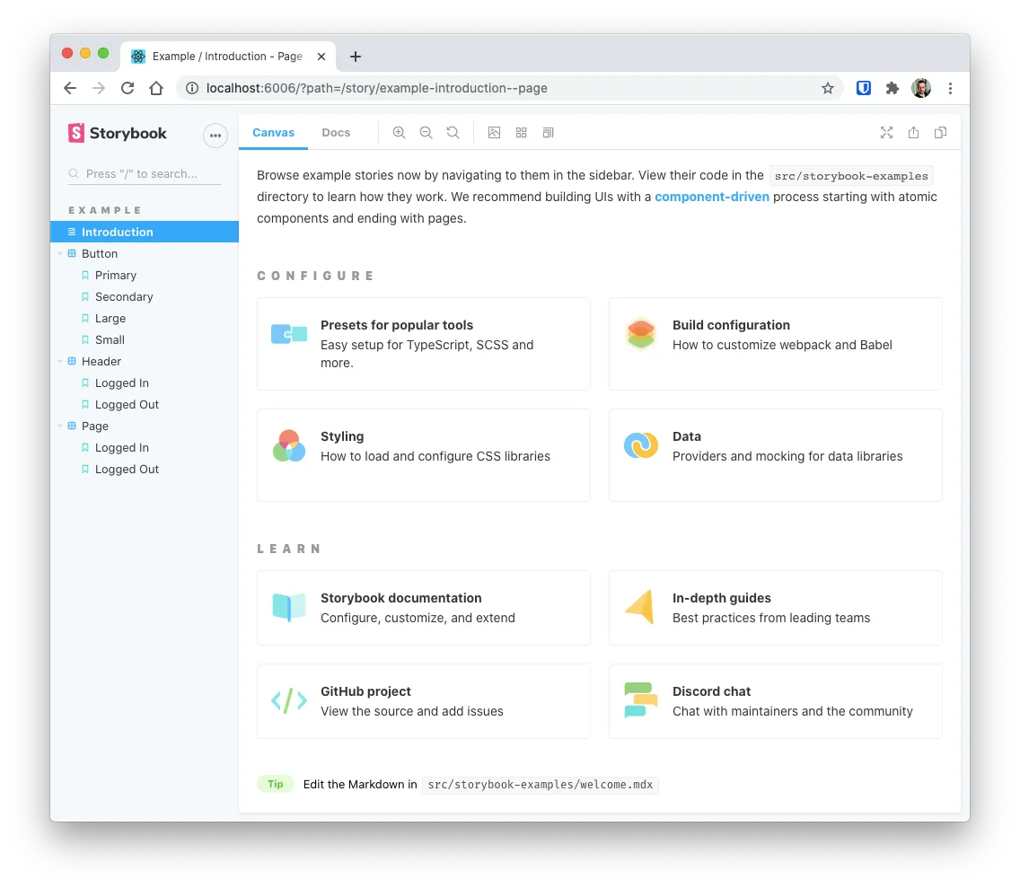
Notice how Storybook created 3 example stories for us, and an Introduction with some shortcuts.
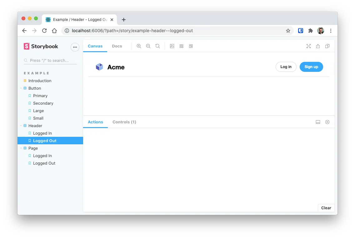
And you can browse those test stories by clicking on the names of each one on the left sidebar. For instance this is how the example story src/stories/Header.stories.js looks in Storybook:
Before we go into creating our own components and stories, lets first review what a story is
Storybook stories
If you review the src/stories/ folder, you can see that there are a bunch of .js, .stories.js and .css files:
$ tree src/stories
src/stories
├── Button.js
├── Button.stories.js
├── Header.js
├── Header.stories.js
├── Introduction.stories.mdx
├── Page.js
├── Page.stories.js
├── assets
│   ├── code-brackets.svg
│   ├── colors.svg
│   ├── comments.svg
│   ├── direction.svg
│   ├── flow.svg
│   ├── plugin.svg
│   ├── repo.svg
│   └── stackalt.svg
├── button.css
├── header.css
└── page.css

1 directory, 18 files
This files where created by the npx sb init command and the contain a bunch of components and stories.
For instance, there is a component called Button created in src/stories/Button.js with the corresponding story in src/stories/Button.stories.js
This is the component:
// src/stories/Button.js

import React from "react";
import PropTypes from "prop-types";
import "./button.css";

/**
 * Primary UI component for user interaction
 */
export const Button = ({ primary, backgroundColor, size, label, ...props }) => {
  const mode = primary
    ? "storybook-button--primary"
    : "storybook-button--secondary";
  return (
    <button
      type="button"
      className={["storybook-button", `storybook-button--${size}`, mode].join(
        " ",
      )}
      style={backgroundColor && { backgroundColor }}
      {...props}
    >
      {label}
    </button>
  );
};

Button.propTypes = {
  /**
   * Is this the principal call to action on the page?
   */
  primary: PropTypes.bool,
  /**
   * What background color to use
   */
  backgroundColor: PropTypes.string,
  /**
   * How large should the button be?
   */
  size: PropTypes.oneOf(["small", "medium", "large"]),
  /**
   * Button contents
   */
  label: PropTypes.string.isRequired,
  /**
   * Optional click handler
   */
  onClick: PropTypes.func,
};

Button.defaultProps = {
  backgroundColor: null,
  primary: false,
  size: "medium",
  onClick: undefined,
};
In this particular component, there is also a .css file that corresponds to the styles apply to it. This means that story book is capable of displaying the component with its styles.
And this are the stories that test or display that component:
// src/stories/Button.stories.js

import React from "react";

import { Button } from "./Button";

export default {
  title: "Example/Button",
  component: Button,
  argTypes: {
    backgroundColor: { control: "color" },
  },
};

const Template = (args) => <Button {...args} />;

export const Primary = Template.bind({});
Primary.args = {
  primary: true,
  label: "Button",
};

export const Secondary = Template.bind({});
Secondary.args = {
  label: "Button",
};

export const Large = Template.bind({});
Large.args = {
  size: "large",
  label: "Button",
};

export const Small = Template.bind({});
Small.args = {
  size: "small",
  label: "Button",
};
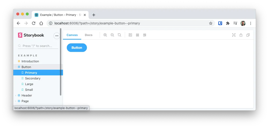
Notice that there are multiple stories on that file ant each story is displaying the button in a different state or configuration.
And here is “Primary” story of the Button stories in Storybook:
So, in conclusion:
- Each
.jsfile is a component - Each
.stories.jsare the stories that test or display the component - A component can include a
.cssfile and it will be displayed
Storybook looks for
.stories.jsfiles because that’s how its configured in.storybook/main.js. You can instruct Storybook to look of another sufix or prefix by configuring thestoriessetting in that file.
Create our first story
Just for fun, lets create a component that displays an <input> field with minal styling.
To create a component and its corresponding story then we need to create 3 files:
- The component file itself
- The styles for the component
- The story for the component
Its recommended that each component has its own sub folder with this 3 files
mkdir -p src/components/input-field
touch src/components/input-field/input-field.{js,stories.js,css}
tree src/components/input-field
src/components/input-field
├── input-field.css
├── input-field.js
└── input-field.stories.js

0 directories, 3 files
The style file is just a simple CSS file with the custom styles of the component.
/* src/compoents/input-field/input-field.css */

.input-field {
  font-size: 1.2rem;
  padding: 0.5rem 1rem;
}

.input-field.small {
  font-size: 0.9rem;
}

.input-field.big {
  font-size: 2rem;
}
Take into account that if your project uses external styles like Bootstrap, Material, Tailwind, Bulma, etc. This have to be added in the configuration file which I will touch upon latter.
The component really has noting special. Its just an input that receives the placeholder and type props, and output the corresponding HTML With the stiles that we created a second ago:
// src/components/input-field/input-field.js

import React from "react";
import "./input-field.css";

const InputField = ({ placeholder, type, ...props }) => {
  const lPlacehoder = placeholder || "Text Input";
  const lType = type || "";
  return (
    <input
      type="text"
      className={`form-control input-field ${lType}`}
      placeholder={lPlacehoder}
      {...props}
    />
  );
};

export default InputField;
Notice that there is a class called form-control that is not included in the .css file. We’ll be working with that class latter.
Finally, we create the stories!
Quoting the Storybook documentation, “The key ingredients (of a story) are the default export that describes the component, and named exports that describe the stories.”
// src/components/input-field/input-field.stories.js

import React from "react";
import InputField from "./input-field";

// The default export
export default {
  title: "New Items/Input Field",
  component: InputField,
};

// Named exports
export const InputFieldDefault = () => <InputField />;
export const InputFieldSmall = () => <InputField type="small" />;
export const InputFieldBig = () => <InputField type="big" />;
In the previous stories example, the default object contains information on which component this story belongs to (InputField) and where in the menu should it be placed.
The const’s InputFieldDefault, InputFieldSmall, and InputFieldBig are the stories we’ll be displaying in storybook.
Here are the results in Storybook:
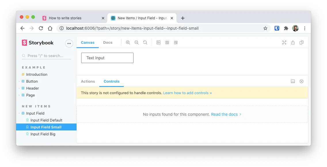
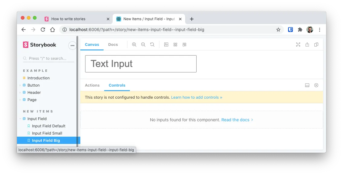
Notice how Storybook converted the camelCased words in actual sentences on the sidebar. For instance, it changed InputFieldDefault to Input Field Default. Take this into account when naming your stories.
You now have enough information to create your stories in Storybook. But there are still, are a couple of additional
Using templates and args
In React we use props to pass arguments to a component, but Storybook calls them args. The reason for the name change is that in Angular and Vue they are called different.
The idea of using args in our stories, its that allows you to use controls and play with your components more interactively (more on that latter). It also allows you to re-use parameters on your stories and reduce the amount of work to create them.
To use args, you have to change how you create the stories. You first have to create a Template object and then you change the .args parammeter or that template for each story.
So, change the .stories.js file to use a template like this:
// src/components/input-field/input-field.stories.js

import React from "react";
import InputField from "./input-field";

export default {
  title: "New Items/Input Field",
  component: InputField,
};

// First create a template
const Template = (args) => <InputField {...args} />;

// Create the story as a copy of the template object
export const InputFieldDefault = Template.bind({});
// change its args
InputFieldDefault.args = { placeholder: "Hello there" };

// Do the same for the "small" version of the input
export const InputFieldSmall = Template.bind({});
InputFieldSmall.args = {
  ...InputFieldDefault.args,
  type: "small",
};

// Do the same for the "big" version of the input
export const InputFieldBig = Template.bind({});
InputFieldBig.args = {
  ...InputFieldDefault.args,
  type: "big",
};
This might seem a little over complicated just by looking at how to code got bigger but the result is the same. But there are several advantages of using this approach:
- You can reuse parameters from story to story
- Combined with
PropTypesallow you to changepropvalues (args) interactively (Next section) - You can configure the template, an those options will get passed down to the stories
You can also pass args in the default export like so:
export default {
  title: "New Items/Input Field",
  component: InputField,
  args: {
    type: "small",
  },
};
Which is a nice alternative.
In the next section we’ll see how using args allows you to change a component prop using controls.
Using controls
To change the stories args interactively, you have 2 options:
- Use
PropTypesin the component - Use the
argTypesin the default export
Let’s start by using PropTypes
PropTypes for Interactive controls
I actually prefer this option, since this way, by using comments, you also get documentation on your stories.
For instance, in the InputField component, we could specify that the type prop is one of “normal”, “big” or “small” by using the PropTypes.oneOf option. And that the placeholder is of type string.
// src/components/input-field/input-field.js

import React from "react";
import PropTypes from "prop-types";
import "./input-field.css";

const InputField = ({ placeholder, type, ...props }) => {
  const lPlacehoder = placeholder || "Text Input";
  const lType = type || "normal";
  return (
    <input
      type="text"
      className={`form-control input-field ${lType}`}
      placeholder={lPlacehoder}
      {...props}
    />
  );
};

InputField.propTypes = {
  placeholder: PropTypes.string,
  type: PropTypes.oneOf(["", "small", "big"]),
};

InputField.defaultProps = {
  placeholder: "Input default text",
  type: null,
};

export default InputField;
Then, we can simplify our stories to be just one.
// src/components/input-field/input-field.stories.js

import React from "react";
import InputField from "./input-field";

export default {
  title: "New Items/Input Field",
  component: InputField,
};

const Template = (args) => <InputField {...args} />;

export const Default = Template.bind({});
Default.args = { placeholder: "Hello World" };
By using argTypes
This is an excellent option too. Specially if you would like to manage all of your storybook settings in the story’s export default object.
The downsize of this method, is that you would have to add more code to your stories instead of your components, and in the case of a refactor you would have to make changes in both parts and not only on your component.
I like to keep my stories as small as possible.
// src/components/input-field/input-field.stories.js
...
export default {
  title: "New Items/Input Field",
  component: InputField,
  argTypes: {
    type: { control: "text" }
  }
}
...
There are extra options on the argTypes, that let you fine control the type and labels of the control. You can take a look at the documentation to find out about them.
Using the controls
This is the great part. Storybook will display the user a Controls panel where you can change the settings
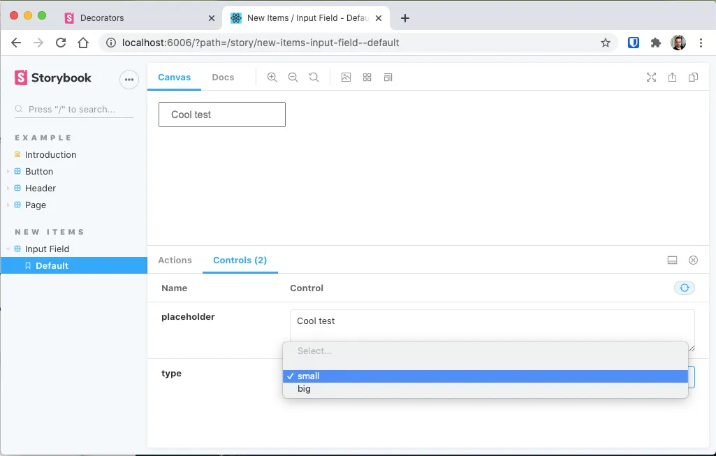
If you don’t see the panel, then type the key
Aon your keyboard, or in the menu next to the Storybook logo, slect Show Addons
Global Parameters
Parameters allows you to configure how an Add-on works. For instance, using parameters you can change how a control is displayed, the background on a story or the documentation of a component.
Parameters can work on a particular story, on a particular component or globaly.
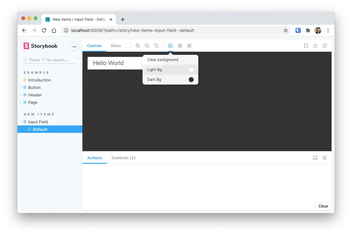
A common use case of a parameter is to add a custom background to the canvas on all your stories. And since its on all the stories, you have to use .storybook/preview.js file.
So, lest modify the Backgrounds add-on, by creating a parameter that controls the background of the canvas.
// .storybook/preview.js

export const parameters = {
  actions: { argTypesRegex: "^on[A-Z].*" },
  backgrounds: {
    values: [
      {
        name: "Light Bg",
        value: "#fcfcfc",
      },
      {
        name: "Dark Bg",
        value: "#333333",
      },
    ],
  },
};
Here I’m creating 2 new background colors. One Light and One dark. And in the preview they would look like this:
Remember, I’m changing the behaviour of the Background Add-on. And I’m doing it at the global level.
If I wanted to do this change only on one group of stories then I would have to do something like this in the input-field.stories.js file:
// src/components/input-field/input-field.stories.js

import React from "react";
import InputField from "./input-field";

export default {
  title: "New Items/Input Field",
  component: InputField,
  parameters: {
    backgrounds: {
      values: [{ name: "WhiteBg", value: "#ffffff" }],
    },
  },
};

const Template = (args) => <InputField {...args} />;

export const Default = Template.bind({});
Default.args = { placeholder: "Hello World" };
Action feedback
There are times where your component receives a callback and you need to know if that callback is getting executed and how the output of the callback looks.
Well… Storybook has a solution for that also. Its called Actions and it allows you to specifya args that are actually functions that will get called.
To tests actions, lets add a onFocus parameter to our <InputField />
// src/components/input-field/input-field.js
// ...
const InputField = ({ placeholder, type, onFocus, ...props }) => {
  const lPlacehoder = placeholder || "Text Input";
  const lType = type || "normal";
  return (
    <input
      type="text"
      className={`form-control input-field ${lType}`}
      placeholder={lPlacehoder}
      onFocus={onFocus}
      {...props}
    />
  );
};
// ...
And on our .stories.js file we have to add a new element in our defaults:
// src/components/input-field/input-field.stories.js
// ...
export default {
  title: "New Items/Input Field",
  component: InputField,
  parameters: {
    backgrounds: {
      values: [{ name: "WhiteBg", value: "#ffffff" }],
    },
  },
  argTypes: { onFocus: { action: "Focused..." } },
};
// ...
What this does is that in our component we now receive a new function parameter that well get triggered when the field gets focused (we called the new parameter and as the action: onFocus).
Then, in our story we configured Storybook to show the Focused... paragraph when the action onFocused got triggered:
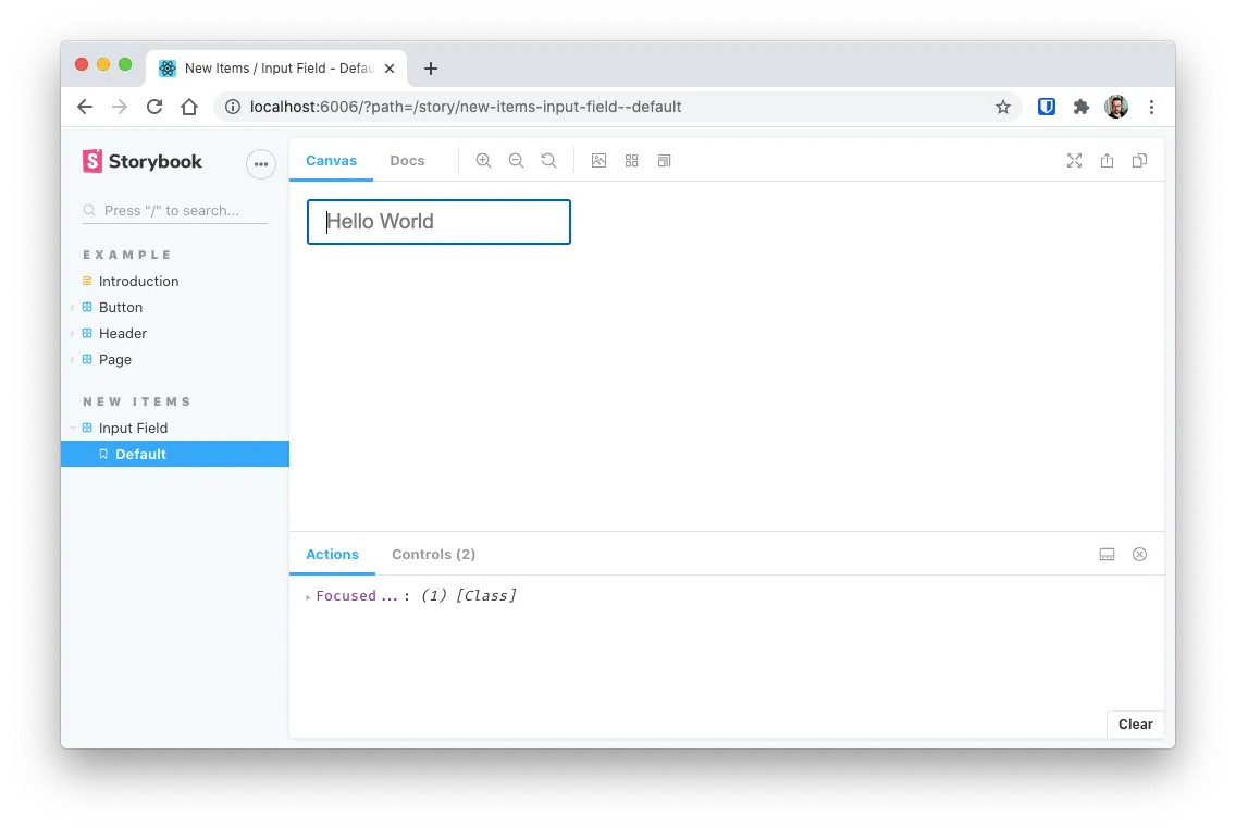
And now we can see if our actions are getting triggered correctly.
Decorators
Let’s say that we want to test this <input> component, but we want to know how does it look like inside a <div> with a <label>.
One approach, would be to create a new component that includes our input inside such a div. This is not a bad idea if we actually plan to use this new component. But, not so great if we just want to test out how it looks. That’s a prefect use case for decorators.
Think of decorators as a way to wrap your component in another component, or simply jsx (like in our example) so you have a better understanding on how it will look in your final application.
So lets change our input-field-stories.js to look like this:
// src/components/input-field/input-field.stories.js

import React from "react";
import InputField from "./input-field";

export default {
  title: "New Items/Input Field",
  component: InputField,
  parameters: {
    backgrounds: {
      values: [{ name: "WhiteBg", value: "#ffffff" }],
    },
  },
  argTypes: { onFocus: { action: "Focused..." } },
  decorators: [
    (Story) => (
      <div className="form-group row">
        <label className="col-form-label col-sm-2">Test Label</label>
        <div className="col-sm-10">
          <Story />
        </div>
      </div>
    ),
  ],
};

const Template = (args) => <InputField {...args} />;

export const Default = Template.bind({});
Default.args = { placeholder: "Hello World" };
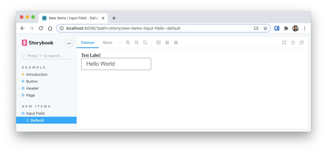
Notice that decorators is an array of functions, where each functions receives a Story parameter.
A great use for decorators is if you are creating a component that is a <tr> and you need to see it inside a table.
Showing console output
I feel like I should apologise because I use console.log() a LOT while I’m developing. I should use it as much, but the fact is that I do.
For those of us that are not that good with debugging tools and don’t want to open the Chrome Developer Tools to see the console output, Storybook provides the Storybook Addon Console which shows the console output (errors and your own calls the console function) on the Actions panel.
Contrary to the other addons we’ve used so far, this one does not come with Storybook out of the box. So we have to install it first:
yarn add @storybook/addon-console --dev
And on .storybook/preview.js add the following line:
// .storybook/preview.js

import "@storybook/addon-console";
And that’s it… Well if you want simple output.
If you need to have the path of the “emiting” component, that is the component that is generating the log, to be added to the output. The you should configure preview.js in the following way:
// .storybook/preview.js

import { addDecorator } from "@storybook/react";
import { withConsole } from "@storybook/addon-console";

addDecorator((storyFn, context) => withConsole()(storyFn)(context));

export const parameters = {
  actions: { argTypesRegex: "^on[A-Z].*" },
};
The added benefit is having the errors be displayed right on the actions section:
Adding external Style Sheets
If you look closely at our InputField component, you can see that I’m using a form-control class that has not style defined anywhere. That’s because I’ll be using Bootstrap as an external CSS file to add some additional styling to my input.
If you are using a component project like Chakra, Material-UI, Reactstrap then you are already set, and you can ignore this. But if you want to use external style sheets read along.
To use an external stylesheet, you need to create a new file in the .storybook/ folder called .storybook/preview-head.html. The contents of this file will be added to the <head> section of the <iframe> where the components are displayed.
So create the file:
touch .storybook/preview-head-.html
And add the following:
<!-- .storybook/preview-head.html -->

<link
  rel="stylesheet"
  href="https://stackpath.bootstrapcdn.com/bootstrap/4.4.1/css/bootstrap.min.css"
  integrity="sha384-Vkoo8x4CGsO3+Hhxv8T/Q5PaXtkKtu6ug5TOeNV6gBiFeWPGFN9MuhOf23Q9Ifjh"
  crossorigin="anonymous"
/>
Since this is a configuration change, you have to restart storybook to view the changes.
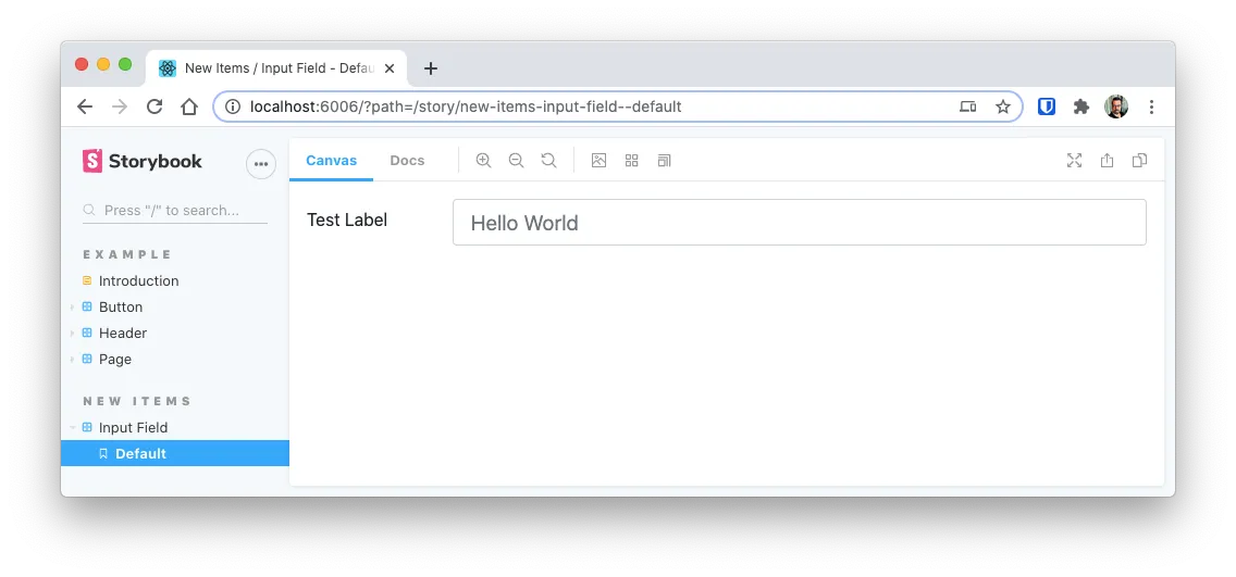
Once you restart you can see that the input field is 100% wide and has a blue hue when you focus it.
NOTE
Adding external style sheets can interfere with the add-on parameters. Like this case, the Bootstrap styles will override the background parameters added in the previous section
Upgrading Storybook
Storybook is a very actively developed project so its common that you get the following notice:
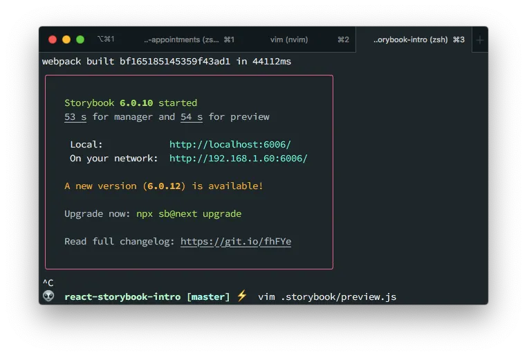
To upgrade Storybook in your project you just have to execute the following command.
npx sb@next upgrade
Take into account that upgrading Storybook can take time. And depending on your network it can teke up to 5 minutes. So don’t be scared if its taking too long to upgrade.
Final toughs
There are a lot of additional things you can do with Storybook like
- Use MDX for the component testing
- Create a complete documentation system for your components
- Publish your stories to a server as a documentation asset for your team
- Auto wrap components in external libraries elements
- Change the background of the preview frame to test against light and dark environments
- Display accessibility results
- Etc.
Head over to the official documentation to know more about all this options.
If you want to take a look to the resulting files for this article just head to https://github.com/marioy47/react-storybook-intro