Getting Started with React Material-UI
Table Of Contents
So I wanted to learn Material UI since it seems to be the best way to use Material Design in a React Applications.
But the problem is that the official docs assume that you already are familiar with other UI frameworks for react and just point you to example projects instead of covering the basics on how to start a project using the toolkit.
So I decided to create my own documentation just for that and here it is.
In this blog entry I’m going to create a very simple React App that does nothing, but that it looks good thanks to Material-UI.
What is Material-UI ?
If you are here is very probable that you already know Material-UI is… But just in case, Material-UI its just a number of React components styled using the material design principles, that are ready to use in any React App.
If you want to start a React Project and don’t want to get caught up in the details of styling you app, then Material-UI is just what you need.
Create a react project and install Material-UI
Lets start our App by doing the following:
- Create the project with
create-react-app - Install Material-UI to the project
- Add the Roboto Google font
- Cleanup files
- Add the responsive meta-tag
Note I’m using yarn instead of npm for installing packages and executing commands since its faster. You can use npm without any problems.
Create the react app and install Material-UI
You must know this by now. If not, then you should be following this tutorial instead
mkdir react-material-ui-tutorial
cd react-material-ui-tutorial
yarn create react-app . # npx create-react-app .
yarn add @material-ui/core
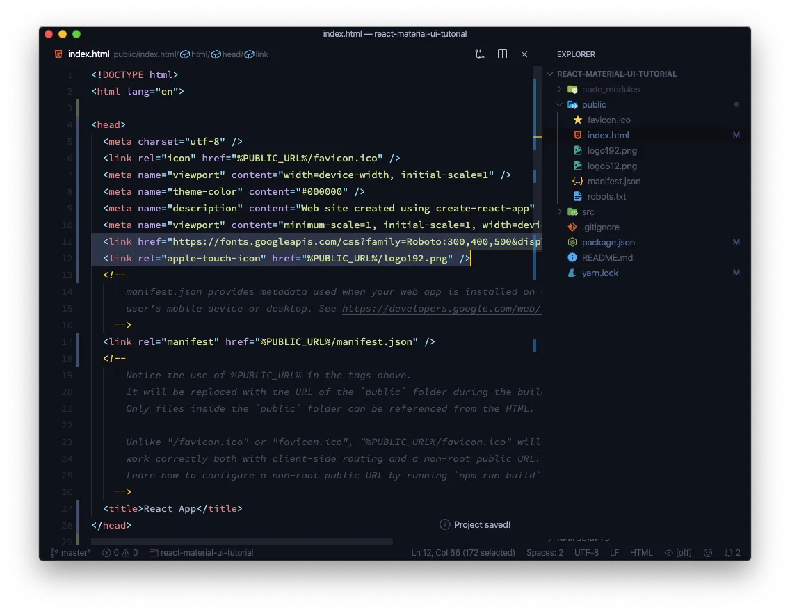
Add the Roboto Font and add the responsive meta-tag
This 2 lines should go into public/index.html before the closing of the <head> tag.
The first one makes our layout to be responsive. The second one loads the Roboto font form Google Fonts
<meta
  name="viewport"
  content="minimum-scale=1, initial-scale=1, width=device-width"
/>
<link
  href="https://fonts.googleapis.com/css?family=Roboto:300,400,500&display=swap"
  rel="stylesheet"
/>
We could bundle the font using the package
typeface-robotobut we would increase the size of our bundle considerable. If you want to know more follow this link
Project cleanup
Now lets remove unneeded files the src/ folder, leaving only index.js and App.js in that dir.
rm src/{App.css,App.test.js,index.css,logo.svg,serviceWorker.js,setupTests.js}
Were using some Bash magic there. Curly brackets allow you to append a list of files.
The src/ directory should look like this:
$ tree src
src
├── App.js
└── index.js

0 directories, 2 files
Refactor App.js and index.js
Then refactor src/index.js so it doesn’t try to import the removed files. At the end it should look like this:
// src/index.js
import React from "react"
import ReactDOM from "react-dom"
import App from "./App"

ReactDOM.render(<App />, document.getElementById("root"))
And finally. We should refactor App.js so it does not issue any errors:
// src/App.js
import React from "react"

function App() {
  return (
    <div className="App">
      <h1>React Material-UI Tutorial</h1>
    </div>
  )
}

export default App
Now, lets start the development by issuing this in the terminal:
yarn start
Great now we can start adding Material-UI components
Normalize or CssBaseline
If you’ve worked with a framework like Bootstrap, Bulma, Tailwind, etc. You’ve noticed that one of the first things they recommend is to use a CSS library like normalize.css or reboot.css to unify or reset the display of native controls.
Material-UI has its own Control just for that and it called CssBaseline.
Adding baseline couldn’t be easier. Just import the component and add it in src/index.js
// src/index.js
import React from "react"
import ReactDOM from "react-dom"
import CssBaseline from "@material-ui/core/CssBaseline"
import App from "./App"

ReactDOM.render(
  <>
    <CssBaseline />
    <App />
  </>,
  document.getElementById("root")
)
What did we do?
- We imported
CssBaseline - We added it before the
<App />component so it covers all of our application - We wrapped everything in a fragment so React doesn’t complain
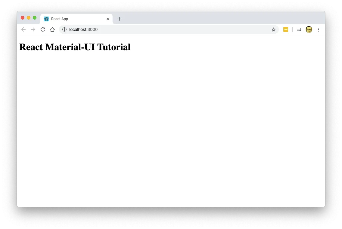
That would render the following:
Notice how the font is a sans-serif family font, and the background is now a light gray. Also, this is how its going to look the same in all browsers. So we have a common Baseline.
Adding our first elements
Adding Material-UI components is usually a 2 step process:
- Import the component you need
- Include it in your JSX
Of course you can (and sometimes must) use properties to configure the component to your needs.
So lets change our src/App.js file to include some content and to add our first components. We’ll be adding a couple of buttons:
// src/App.js
import React from "react"
import { Button } from "@material-ui/core"

function App() {
  return (
    <div className="App">
      <h1>React Material-UI Tutorial</h1>
      <h2>This Could be a subtitle</h2>
      <p>And this is a paragraph</p>
      <Button variant="contained" color="primary">
        A Primary button
      </Button>
      <Button variant="contained" color="secondary">
        A Secondary button
      </Button>
    </div>
  )
}

export default App
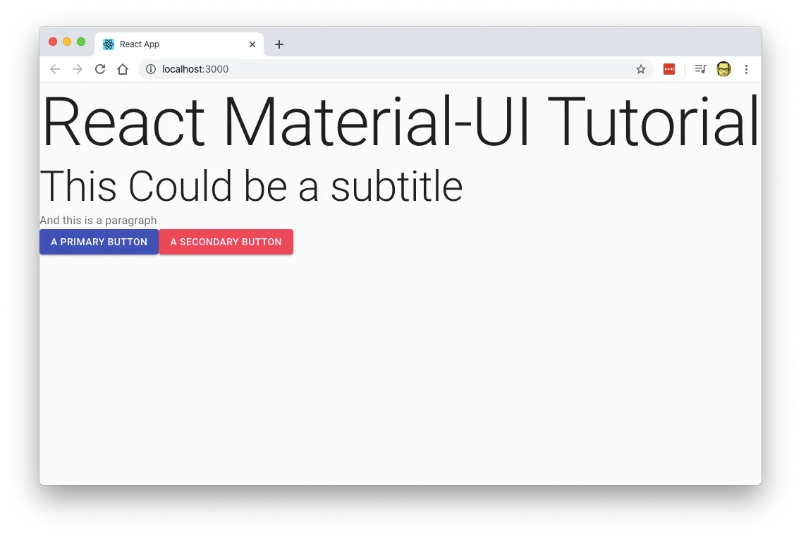
Which would render this:
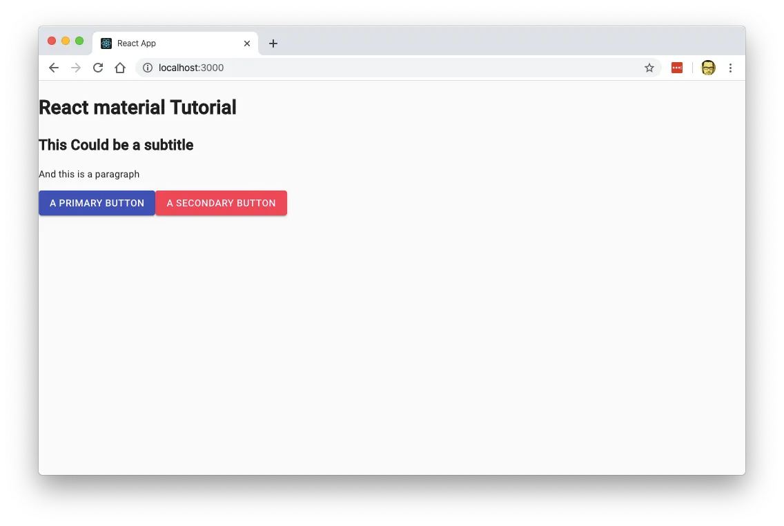
As you can see, we now have a page with 2 buttons: One primary (the blue one) and one secondary.
Typography
One important aspect of the Material Design Language is the font management.
If you go over the Material Design Documentation, you can see that there are a ton of options and rules for font usage and management.
That’s why Material-UI has the very powerful component <Typography /> which as a ton of options as you can see in the documentation. The cool thing is that is only one component.
So lets change hour headings and paragraphs to use the <Typography /> component:
import React from "react"
import { Button, Typography } from "@material-ui/core"

function App() {
  return (
    <div className="App">
      <Typography variant="h1" align="center">
        React Material-UI Tutorial
      </Typography>
      <Typography variant="h2">This Could be a subtitle</Typography>
      <Typography color="textSecondary">And this is a paragraph</Typography>
      <Button variant="contained" color="primary">
        A Primary button
      </Button>
      <Button variant="contained" color="secondary">
        A Secondary button
      </Button>
    </div>
  )
}

export default App
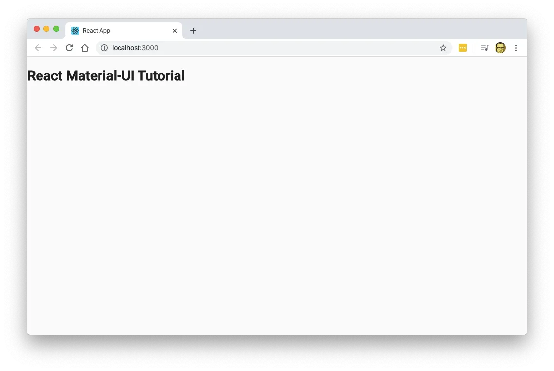
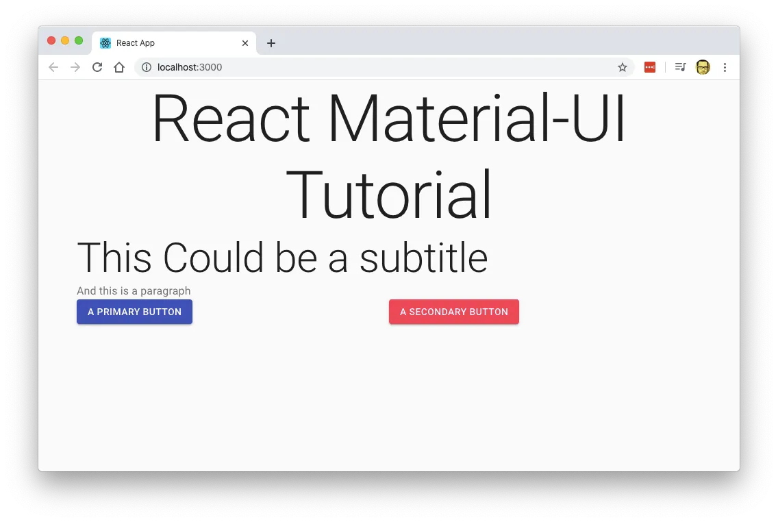
That will yield
Now we’re starting to make some progress.
Create layouts using Grid
Right now our content seems kind of Thrown out There. that’s because we’re not using any kind of layout or placement.
Lets fix that by using a Material-UI Grid system so our content is in the middle and centered. Lets edit src/App.js with the following:
import React from "react"
import { Button, Typography, Grid, Container } from "@material-ui/core"

function App() {
  return (
    <div className="App">
      <Container maxWidth="md">
        <Grid item md={12}>
          <Typography variant="h1" align="center">
            React Material-UI Tutorial
          </Typography>
          <Typography variant="h2">This Could be a subtitle</Typography>
          <Typography color="textSecondary">And this is a paragraph</Typography>
          <Grid container>
            <Grid item md={6}>
              <Button variant="contained" color="primary">
                A Primary button
              </Button>
            </Grid>
            <Grid item md={6}>
              <Button variant="contained" color="secondary">
                A Secondary button
              </Button>
            </Grid>
          </Grid>
        </Grid>
      </Container>
    </div>
  )
}

export default App
If you look closely, you can see that we added a <Container /> tag and multiple <Grid /> tags.
If you’ve worked with Bootstrap you’ll see that <Container /> works very similar to the .container Bootstrap class: It incloses the content in a container with a fixed with. In my case I used a container of 960px wide, hence the maxWidth="md" parameter.
Keeping the analogy to Bootstrap, you can see that the <Grid /> component works both as the .row and the .col Boostrap classes.
When used with the parameter container the Grid component creates a row that contains one or more columns. If you want to be more technical, the <Grid container /> creates an element with display: flex.
When used with the item parameter, it works like the .col-xx-## Boostrap class: It create a column inside the row. And again, being technical, it means create an element with flex-grow and flex-basis.
One last peace of important information. Like most of the CSS frameworks it works by the 12 column paradigm. Dividing the with of the canvas in 12 columns. And it is very important that on the <Grid item /> you also specify either xs, sm, md, lg or xl. Otherwise Material-UI wont know how big or small is the column and it wont stretch to fill the required space.
If you want to know more about the Grid parameters, you can browse the API documentation.
Paper
The idea behind Material Design is to emulate how humans perceive materials with the use of shadows and layers.
So we have Paper which is a way to emulate a sheet of paper with elements over it.
We’re going to use Paper to enclose our app and making it more organized.
// App.js
import React, { useState } from "react"
import { Typography, TextField, Paper } from "@material-ui/core"

function App() {
  const [excercises, setExcercises] = useState([])
  const [title, setTitle] = useState("")

  return (
    <Paper clssName="App">
      <Typography component="h2" variant="h1" align="center" gutterBottom>
        Excercises
      </Typography>
      <form>
        <TextField
          name="title"
          label="excercise"
          margin="normal"
          value={title}
          onChange={e => setTitle(e.target.value)}
        />
      </form>
    </Paper>
  )
}

export default App
Notice that we are including all the Material-UI elements ant that now everthihng is inclosed in <Paper> instead of a <div>
Alter the CSS
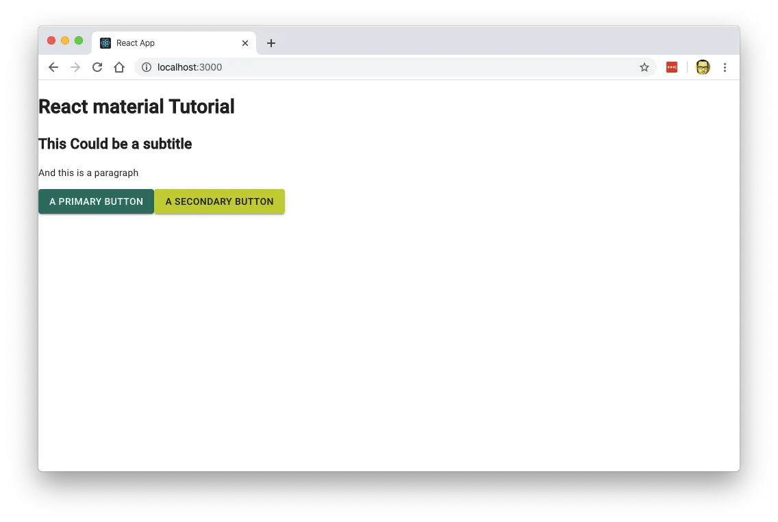
Create a Theme
We’re going to start by creating a theme.
But do not get intimidated. We’re just going to change the primary and secondary button colors. This will give us an idea on how themes works in React.
The first step is to create a theme.js file and call createMuiTheme with our new theme parammeters.
// src/theme.js
import { createMuiTheme } from "@material-ui/core/styles"

const theme = createMuiTheme({
  palette: {
    primary: {
      main: "#00695c",
    },
    secondary: {
      main: "#c0ca33",
    },
    background: {
      default: "#fff",
    },
  },
})

export default theme
And change index.js so the app supports themes:
// src/index.js
import React from "react"
import ReactDOM from "react-dom"
import CssBaseline from "@material-ui/core/CssBaseline"
import { ThemeProvider } from "@material-ui/core/styles"
import App from "./App"
import theme from "./theme"

ReactDOM.render(
  <ThemeProvider theme={theme}>
    <CssBaseline />
    <App />
  </ThemeProvider>,
  document.getElementById("root")
)
And we would have the following:
Other Tutorials
Additional Material-UI documentation is kind of scarce and there aren’t many good tutorials that cover the basic. So here are a couple that you might want to check out: